Last week, my incredibly generous boss managed to get one of my little videos onto nytimes.com
I can't embed it because of music licensing rights [grrrrr music licensing] -- but you can watch it by clicking below:
The general "aesthetics" I was working with were the concept of "Library for the Future" and an 80s vibe that I got from the machine itself.
Main lessons learned were that red on black text artifacts HORRIBLY. Well, I knew this already, actually-- but thought that the image of the red laser/bar code scanner was too good a motif to pass up because of bad compression blah blah blah. So this is how the light-scanning of red letters began and ended. Anyone have thoughts on that type of situation? I sacrificed clarity/quality for what I thought was a perfect visual motif. Would you do the same?
Anyway, enjoy/let me know what you think if you haven't already.
Well... yes... ok. I will first acknowledge that this post is going to a) be undoubtedly overly sentimental and cheesy, b) potentially be a touchy little topic for the few diehard romantics out there like yours truly, and c) may or may not seem kind of trivial. So let me define this thing up front.
There are a few things in this world that, whenever I encounter them, make me daydream of love. I'm not talking about with a specific person. Something that I shared. No.
There are a few things that, empirically, a priori, make me feel like love exists. The abstract concept becomes concrete. With only the vague semblance of a picture of another person-- unidentifiable. It's more about the feeling.
Curiously, most of the things that do this have to do with a certain shade of light-- yellow light, to be specific. Warm light in which you can see the dust swirling around....
Songs layered with an infintely repeating short theme...
Super-imposed, out of focus shots...
(similarly... Kaleidoscopes...)
The pressure points on my palms...
and
The smell of honeysuckle...
The point of this short list is to demonstrate that none of these things either make sense or seem remotely connected. But they all dredge up the same feeling.
I'm not super eager to figure out why these things inspire these emotions, but I felt like throwing them out there for you all. Perhaps-- much like that love potion in Harry Potter that makes you smell specific things-- everyone's list will be very different. I suppose it has to do with subliminal attachments made in childhood-- but I'm no psychologist.
Funny thing is that, often, I end up finding these little things embedded in art where they endeavor to inspire the exact feelings that they do, in fact, make me feel.
Take, for example, my favorite perfume:
After a few hours, it smells exactly like honeysuckle.
Or:
Poster, selling the movie as a romantic love story... look at the light.
So, I suppose, my question is-- are these "love aesthetics" as I'm calling them-- specifically mine, or is there something universal that my subconscious is tapping into?
I think it's a little in between. Which is why these aesthetics, being not the feeling themselves but tangential spring points, can be used for trickery, irony... and we all can get duped.
Oh... Woody Allen. Teaching us a little something about mistaking perfect light for perfect experience...
[Photo 1 from Bloom, Grow, Love, Photo 2 from Eternal Sunshine of the Spotless Mind, Photo 3 from the Brooklyn Botanical Garden Flickr, Picture 4 from Lollia]
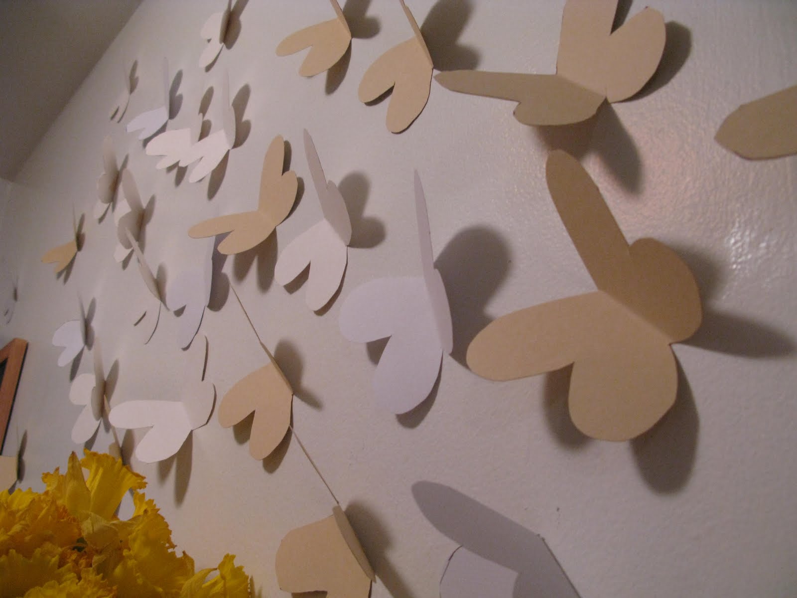
Saw this post on Design Sponge.... and got super inspired about the vacant space that was left open when I discarded the horribly broken microwave that shorted out one of my outlets.
So, AmyCatB came over and we got thai food and did this:
I first picked up the book after I read a review in Time Magazine last summer. It's some seriously fantastic storytelling -- not to mention, pretty revelatory. Purchase yourself a copy, asap.
(Great cover, right?)
Listening to Holmes speak was very much like reading his writing-- you become infected with his enthusiasm, not only for the subject, but for the way he describes it. He is one of those rare, fascinating creatures who is able to make even the malfunctioning of a microphone seem epic and philosophical.
But the golden gems of his talk were "6 Tenants of Non-Fiction Writing," which he sprinkled throughout the hour and a half with characteristic storytelling prowess-- foreshadowing the principals and then demonstrating with lovely anecdotes from his books and experiences. And, yes-- the ideas make his non-fiction absolutely dynamic-- but I also found that they stimulated my own thinking about my fiction writing.
See... I've been having a really rough time writing a short film. Usually, I can just put stuff down on paper. It's not always good, but I can put it down. However-- this short.. has some heavy implications.
And I was stuck. On page 3:
And I just, couldn't move forward. But then I sat down in this talk, and my mind started racing.
Holmes outlined 6 points:
1) Vertical Footnotes
2) Starting in the middle
3) Creating a relay race
4) The "Titanic Principle"
5) Big Window/Small Room
6) The significant anecdote
I'm going to take a stab and describing #1 because this is the one that I found most useful. (Mr. Holmes: If I massacre this, I significantly apologize.)
The concept of verticle footnotes is based on the idea that you engage your audience in a story written (basically) in chronological order. However, in "Age of Wonder" Holmes is dealing with ideas that benefit from historical and contemporary context. So, in order not to break the reader's engagement with the primary story-- he uses a footnote to jump vertically through time to provide contextualization. Essentially he makes his ideas timeless by using the footnote to add the wisdom of the ages-- while allowing his story to continue progressing in its own time-governed world in the body text. Literary Time Travel.
I found this device particularly useful because it provides you with opportunities to add significance to your story by juxtaposing it with the knowledge of time. It reminded me of why the first season of Lost was so good: the flash backs let you gradually understand characters' actions while they were isolated on the island by contextualizing people with their own past. You come to really see that, even though these events are happening vacuum, characters are informed by previous experience. And-- the previous experience also gains significance- because it becomes a defining event. Both stories gain more importance because you are watching one person--analogous to the scientific concepts in Holmes' vertical footnotes-- at different stages of knowledge and experience. So the gap between current and past becomes the story.
(so sue me, I might have a secret thing for Jack)
Long story short (not really if you watched the clip...) is that it got me thinking about how to tell a really good short story that focuses on communication of experience as opposed to a traditional "story arc..." yet still matters for the audience. Using that idea of the "gap" being profound may, in fact, be the "Why" that I've been looking for... I think.
My story is about an older couple, on the day that their last child leaves for college, dealing with the fact that they are now alone with each other. By juxtaposing that with a couple, perhaps the same couple, when they getting to know each other for the first time seems like it will add some heft that I, previously, couldn't muster.
Then again... perhaps I'm trying to make a career out of adding profundity to things that don't need it...
Last Saturday, my fantastic friend Jen invited me to join a visit to the Tim Burton exhibit currently at MoMA.
While Tim Burton's movies are always incredibly visually interesting, I don't think I ever really envisioned him as an "Artist." Yes, I tend to view filmmakers as artists in their own right-- but I don't think I had ever really thought of Tim Burton this way, for some reason. Maybe because his films are playful, even (or especially) when they depict the grotesque.
However-- seeing him on paper opened him up in some way. The exhibit not only displayed his evolution from sketching to film making, but also did a phenomenal job of laying bare his process. The most fascinating pieces were those around the creation of the short film "Vincent." Burton's character studies and storyboards were really excellent.
My favorite two individual pieces in the exhibition were a legal pad of notes from the making of Beetlejuice ... on which-- get this-- he reminded himself to remember Virginia Woolf during the story construction. How about that for a mind flip??
Also-- there was a glass display case with some of the Nightmare Before Christmas characters. I wish that I had a camera, because they had Jack-- and about 20 different versions of his head, with different facial expressions on each. I always thought that the models were mold-able. Luckily-- someone else got a partial pic here.
Overall-- my main reaction to the exhibit was that I wished MoMA regulated how many people were inside more closely...
But, more importantly, I thought the exhibit ultimately not only fantastically showcased Tim Burton's creativity, but also made the artistic process really accessible.
i.e. One of his early animations was in a condition where it still had lines in the picture showing how Burton was figuring out the form of his characters. Much like the below sketch-- but animated.
As someone who is currently trying to negotiate a day job and other creative efforts, I took particular notice of and interest in this earlier part of the exhibit-- everything before the "Beyond Burbank" [read: career as a film director] section-- where you could see Burton channeling his creativity outside of his (apparently frustrating) job at Disney-- but also utilizing his time there to contribute to his career-- i.e. his really fascinating Hansel and Gretal video adaptation which played only once on the Disney channel.
It was inspiring, as a relatively young artist, to see this development and negotiation. The online exhibition (though fantastic in its own right) does not do justice to this aspect of the physical exhibit. The experience of walking through his works -- seeing not only his notes and creative process on paper, but also their development as he aged -- is really worth actually going to see.
So if you are a young or aspiring artist-- get yourself to 53rd street, I say.
[I would argue that MoMA would agree with me on this point, as their Family Activity Guide for the exhibition utilizes the experience of the instillation to encourage children's understanding of creativity and process.]
"Untitled (Trick or Treat)," Tim Burton, 1980
On a side note... the phsyical objects on display were so richly deatailed and painstakingly crafted, one wonders if (what I believe is) the decline in quality of his films have something to do with his more frequent use of computer generated imagery (think Big Fish, Charlie & The Chocolate Factory, Alice in Wonderland) as opposed to phsycial fabrications (Beetle Juice, Batman, Edward Scissorhands). But, that is a question for another day...
Picture 1 from NYtimes.com, 2, 3, 5, 6 from MoMA online exhibition, 4 unkown.
Back in January, I did my one and only "Best of" for 2009:
"The Best Little Piece of Film Making I Saw"
Consistently, I have heard Pixar praised for being able to tell a story without dialogue-- which they do here, and, perhaps more notably, in the first 30 minutes of Wall-E.
The admiration attached to these very well crafted segments got me thinking about sound and storytelling. Are these pieces of film successful and especially emotionally evocative because they are operating exclusively on a visual level? I'd say no-- because by no means is Pixar making silent pieces of film. Music and sound effects play a hugely important role in your experience of the story. What then, makes the absense of dialogue notable?
Being the huge dork that I am, I went back to my massive, massive film theory book from college and looked up a few essays on sound.
(It's all beat up and pretty, isn't it?)
Anyway, one particular explanation caught my eye:
"If a man is heard speaking, his gestures and facial expression only appear as an accompaniment to underline the sense of what is said. But if one does not hear what it said, the meaning becomes indirectly clear and is artistically interpreted by muscles of the face, of the limbs, of the body. The emotional quality of the conversation is made obvious with a clarity and definiteness which are hardly possible in the medium of actual speech. ... The absence of the spoken word concentrates the spectator's attention more closely on the visible aspect of behavior, and thus the whole event draws particular interest to itself. ... If the words are omitted, the spectator surrenders entirely to the expressive power of the gestures."
-- Rudolf Arnheim, "The Making of a Film," Film as Art, 1933.
Pixar is doing exactly this-- but they are also using the sound to bolster the image. The sounds are pure in a way that dialogue is not. Sound effects and music are manifestation of direct emotion. Where-- dialogue....
One thing that I think we tend to disregard about the importance of speech is our ability to use words to hide what we are feeling instead of actually expressing ourselves. Which is one reason why, by removing dialogue, the gestures become expressive. The characters have nothing to hide behind.
However, the camera can change this-- adding a level of artistic expression that is even more rich than the 'definite' and 'clear' presentation in the absence of dialogue.
For example-- one of my favorite scenes of all time:
(You need only watch until around 6:00)
We look at the beginning of Up and are able to recognize the story for what it is in it's purest sense-- an expression of bare emotion-- because there is no dialogue to either muddle our perception or to distract us from the gesture. But-- The Age of Innocence-- forces us to reconcile what is being spoken with the character's true meaning in their body language and the way it is revealed to the audience by the camera. It uses form to express meaning.
So, yes-- Up is lovely filmmaking-- economical and emotionally stirring. But, The Age of Innocence reaches an entirely different level. It is...impressionistic.
[Disclaimer-- this post was mainly written to help me figure through some writers block. You may enjoy it for whatever you so choose.]
I am a video and multimedia creator, who spends my days at The New York Public Library and my nights in Brooklyn. I want to discover not simply that things are beautiful, but why we perceive them this way. That being said-- I also just like to stare at pretty pictures.